ARTFISH visualisations
Source:vignettes/05_artfish-visualisations.Rmd
05_artfish-visualisations.RmdIntroduction
This vignette describes the visualisation tools available in the
artfishr package for exploring outputs computed by the
Artfish statistical indicator, following the ARTFISH methodology.
The visualisations are organised into three modules:
- Total Catch and Effort
- Catch and Effort by Fishing Unit
- Catch and Effort by Species
Artfish - Total Catch and Effort
The Total Catch and Effort module provides visualisations of key aggregated metrics derived from Artfish computations. It serves as a dashboard for tracking the overall evolution of fishing activity over time, with the ability to focus on specific fishing units.
In the top-left section of the interface, a date range selector allows the user to define the analysis period. In the top-right section is a drop-down menu to select specific fishing units.
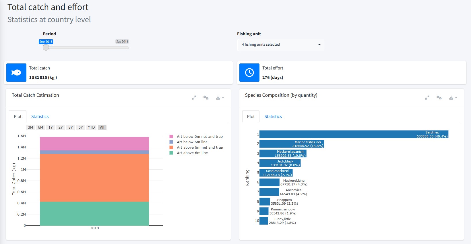
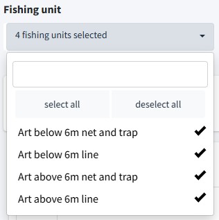
By default, all fishing units are selected in the drop-down menu, meaning that all available data are aggregated. To isolate specific fishing units for detailed analysis, uncheck the units you wish to exclude from the list.
Below these filters are summary indicators displaying the total catch and effort for the selected period and fishing unit(s).

Five standardized graph boxes are displayed below the summary indicators. Each box contains a chart summarizing one of the following metrics:
- Total Catch Estimation
- Species Composition (by Quantity)
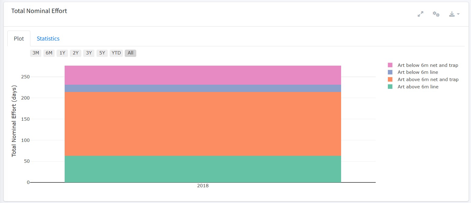
- Total Nominal Effort
- Number of Active Vessels
- Average CPUE
These charts are shown by default when the module is loaded and are automatically updated when a new fishing unit or different reporting period is selected.
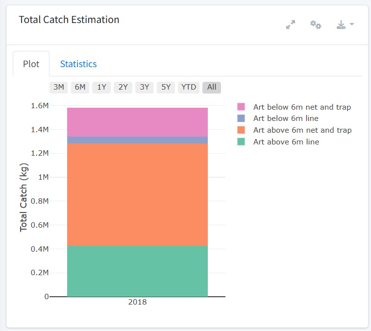
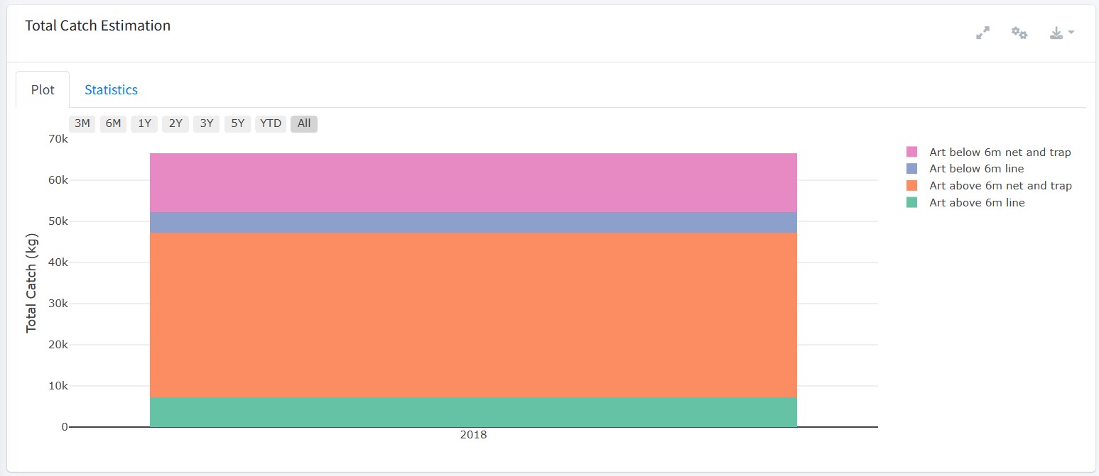
The first chart displays the total catch estimation (kg) by selected fishing unit(s) for the selected time period.
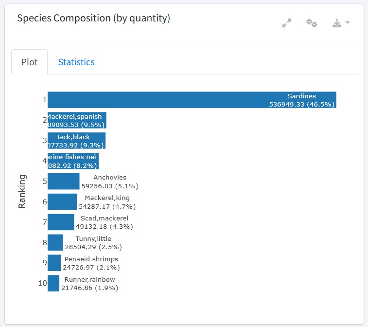
The second chart displays the ranking of all available species for the selected reporting period and fishing unit(s), with tooltips providing the absolute values and their relative contribution to the total.

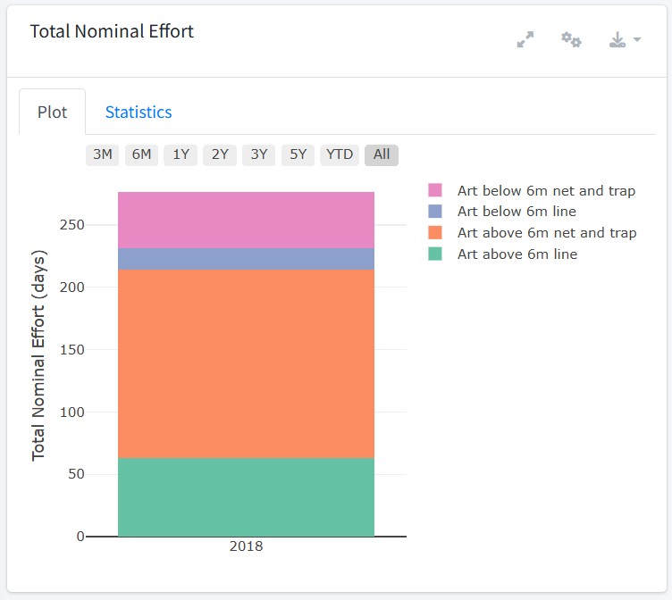
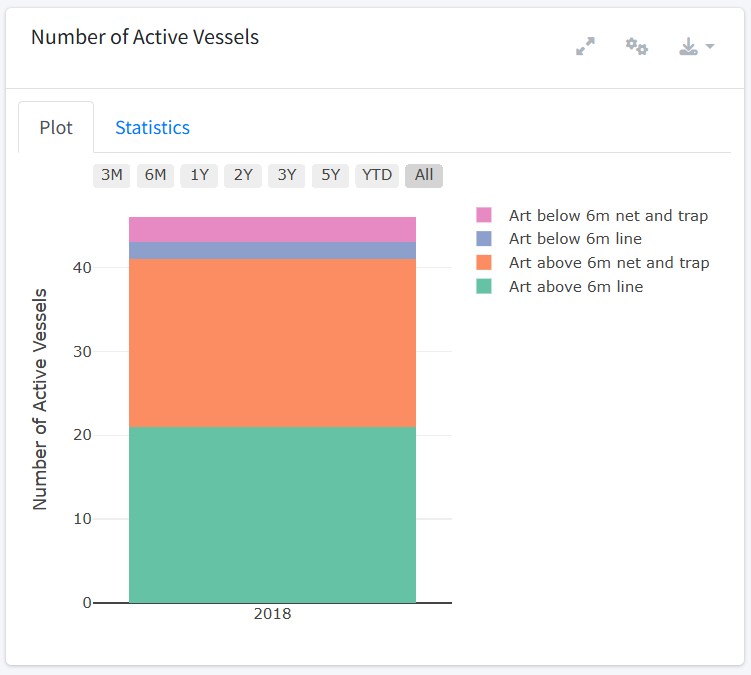
The next row of two charts displays the total nominal effort (days) and the number of active vessels by selected fishing unit(s) for the selected reporting period.
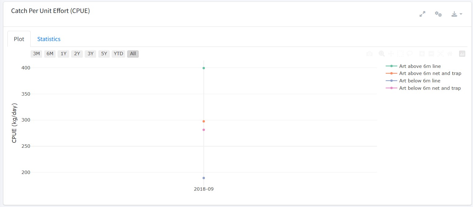
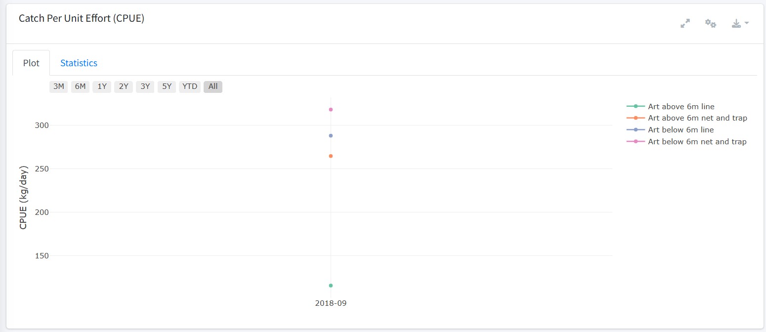
The final chart displays the catch per unit effort (kg/day) by the selected fishing unit(s) for the selected reporting period.
Artfish - Catch and Effort by Fishing Unit
The Catch and Effort by Fishing Unit module provides a dedicated workspace for exploring annual Artfish results with a focus on individual fishing units.
Similar to the previous module, a date range selector in the top-left section of the dashboard is used to set the analysis period. A drop-down menu in the top-right section allows the user to select one or more fishing units.
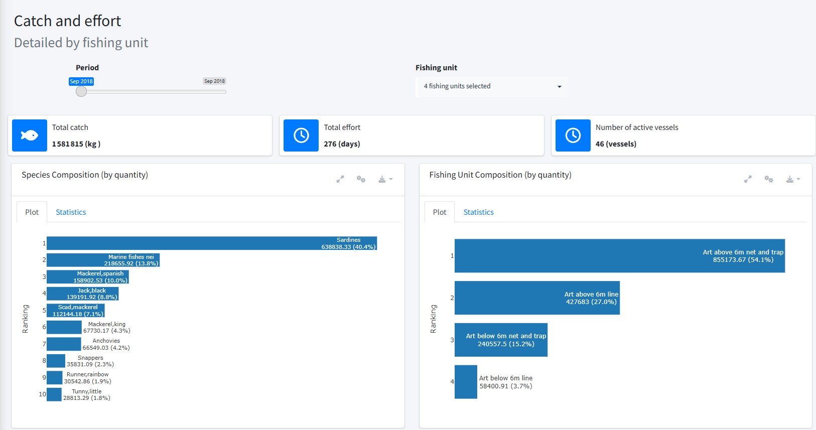
Below these filters are summary indicators displaying the total catch, total effort, and number of active vessels for the selected reporting period and fishing unit(s).

Seven standardized graph boxes are displayed below the summary indicators. Each box contains a chart summarizing one of the following metrics:
- Species Composition (by quantity)
- Fishing Unit Composition (by quantity)
- Total Catch Estimation
- Catch Per Unit Effort (CPUE)
- Total Nominal Effort
- Activity Coefficient
- Number of Active Vessels
The first chart displays the ranking of all available species for the selected reporting period and fishing unit(s). In this example, three fishing units were selected.
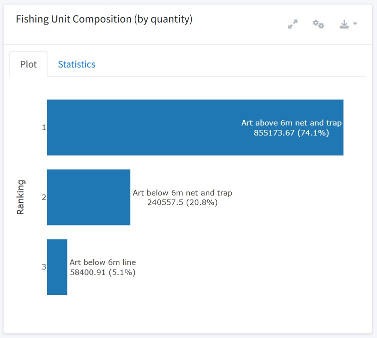
The second chart ranks the fishing units by catch quantity for the selected reporting period, with both charts containing tooltips that provide the absolute values and their relative contribution to the total.
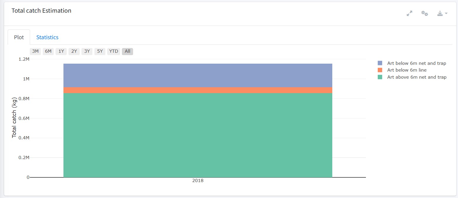
The third chart displays the total catch estimation (kg) by fishing unit for the selected reporting period.
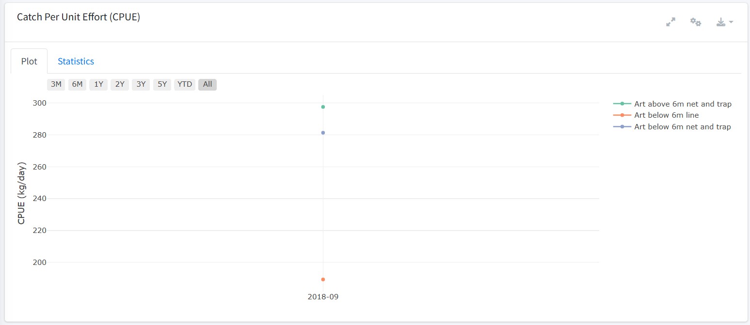
The fourth chart displays the catch per unit effort (CPUE) by fishing unit for the selected reporting period.
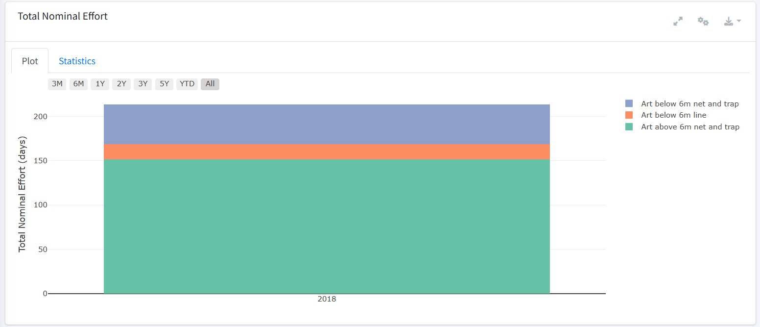
The fifth chart displays the total nominal effort (days) by fishing unit for the selected reporting period.
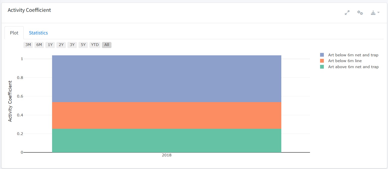
The sixth chart displays the activity coefficient by fishing unit for the selected reporting period.
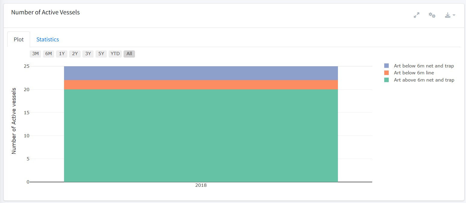
The final chart displays the number of active vessels by fishing unit for the selected reporting period.
Artfish - Catch and Effort by Species
The Catch and Effort by Species module provides a species-oriented workspace for exploring Artfish results. The initial view displays a species selector containing all available species in the database.
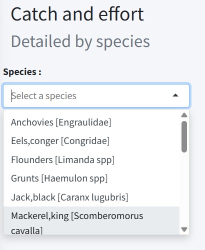
Once a species has been selected, the rest of the module becomes visible. Directly below the species selector is a date range selector to define the analysis period. Below this is a fishing unit drop-down menu that allows the user to further refine the analysis.
By default, data from all fishing units are displayed, but the user may also restrict the view to a single fishing unit.
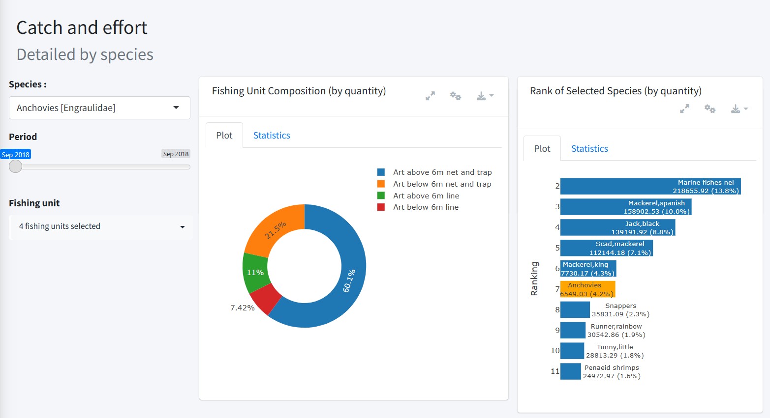
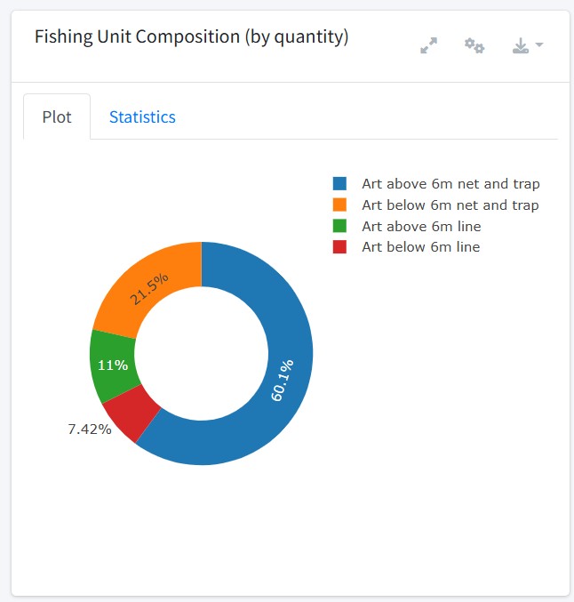
The upper right panel contains two charts. To the left, a donut chart displays the distribution of total catch for the selected species and reporting period across the fishing units.
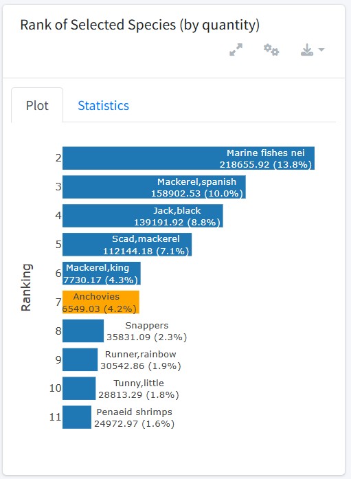
To the right, a ranking chart displays the position of the selected species (in orange) relative to all other species, based on the total catch quantity. Tooltips within the chart provide additional insights into absolute values and relative proportions.
Below these visualisations are four indicator boxes summarising key metrics for the selected species:
- Total Catch (in kilograms by default)
- Average Price (computed from value and catch)
- Total Effort
- Average Species Ratio

Below the indicator boxes, three standardized graph boxes are displayed in this module. Each box contains a chart summarizing one of the following metrics:
- Total Catch Estimation
- Catch Per Unit Effort (CPUE)
- Total Nominal Effort
The charts displayed in this module are similar to those described in the Total Catch and Effort module, but from a single species perspective.
Summary
This vignette describes the visualisations, computed by the Artfish statistical indicator, for the following modules:
- Total Catch Estimation
- Catch and Effort by Fishing Unit
- Catch and Effort by Species
Appendix
Annex A - Figure Box and Chart Additional Features
Each chart is presented within a figure box. The interface is broken down into layout controls, interactive data filters, and specific plot manipulation tools.
Window and Layout Controls
- Plot and Statistics Tabs (top-left): Switch between the Plot tab to view the visual chart, and the Statistics tab to view the underlying data table.
- Time Range Selector (below the tabs, top-left): Use the quick-filter buttons (‘3M’, ‘6M’, ‘1Y’, ‘2Y’, ‘3Y’, ‘5Y’, ‘YTD’, ‘All’) to instantly adjust the time period displayed on the chart.
-
Top-Right Header Icons:
- Fullscreen Icon: Expands the plot to fill the screen for easier viewing.
- Toolset Icon: Opens a right-side configuration sidebar to further adjust the plot, depending on the module and figure box. For these modules, it allows users to adjust the plot type and the plot granularity.
- Download Button: Downloads the current plot in either PNG or HTML format.
Chart Legend and Interactions
- Data Hovering: Move your cursor over any data point on the plot to view its specific values and information.
- Isolate Data Groups: Double-click a group name in the right-hand legend to show only that group and temporarily hide all others. The active group name will appear in black text, while hidden groups turn grey.
- Exclude Data Groups: Click a group name once in the right-hand legend to hide it from the plot.
- Undo Isolation/Exclusion: Click any hidden (grey) group name once to restore it to the plot view.
- Double-click on the plot to restore the original view when zoomed in.
Chart Toolbar Action Buttons
An additional set of action buttons is located in the top-right corner of the plot area itself.

From left to right, these include:
- Download as PNG: Saves a snapshot of the current plot view as a PNG image.
- Zoom: Click and drag a bounding box directly on the chart to zoom into a specific area.
- Pan: Click and drag to slide the chart view horizontally or vertically.
- Box Select: Isolate data points by drawing a rectangular selection box over them. Click the icon again to deselect.
- Lasso Select: Isolate data points by drawing a free-form shape around them. Click the icon again to deselect.
- Zoom In: Instantly steps the zoom level closer in.
- Zoom Out: Instantly steps the zoom level further out.
- Autoscale: Automatically adjusts the chart axes to fit all visible data cleanly.
- Reset Axes: Resets the chart back to its default, original scale after zooming or panning.
- Plotly Link: Opens and views the chart within Plotly.js (v2.11.1).